Many of us are facing bitter winter weather just now. So, it seemed an appropriate time to talk about…painting snow!
Two of the main concepts to keep in mind when painting snow are value and color temperature. When painting a light, highly reflective surface like snow we are hampered by the value limitations of our materials. Our white paint is the lightest light we can muster. In order to effectively represent snow and its surroundings, we must darken its value just a little, as well as the other planes in the landscape likes trees, hills and sky.
Because of its reflective surface, the color of snow is affected by the colors around it, most particularly the sky. That is why on a bright sunny day when the ground is covered with snow, you will see those intense blue shadows. That’s the zenith of the sky reflecting into the shadows. Recognizing the source of that color and maximizing it helps to describe the snow. In this painting you can see contemporary American landscape painter Stapleton Kearns doing just that. He has used a warm white for the sunlit portion of the snow and cooler whites to depict the planes turning from the light and the shadows. This is a great example of how one might model the snow on a sunny day. Notice too how the value of the sky has been lowered just a bit and the rest of the scene brought into that range as well. The warm notes in the foreground logs provide a temperature counterpoint to the overall cool cast of the painting. Finding opportunities to include a warm note in a snow painting adds variety and richness to the snow filled world.

But, often when we paint snow, it’s not a sunny day. Here is a lovely tonal homage to snow by American painter John Carlson American ,1875-1947), author of Carlson’s Guide to Landscape Painting. The color of the snow reflects the muted sky color, and the close values of grey, brown and violet in the near and distant trees evoke a quiet winter day in the woods. Subtle warm notes in the trees and plants sticking out of the snow provide the needed variety in temperature.
Here’s one of my favorite snow paintings by Frederick Mulhaupt (American, 1871-1938 ). Mulhaupt has used value masterfully here. The counterchange between the light tree trunks and darker confers behind is echoed by the small triangle of dark water on the left. The violet sky is darker than the snow which helps to set it off and appear luminous. Subtle temperature and value changes within the snow describe the ground plane underneath, and the dark bits of earth peaking through lead the eye to the central arrangement of trees. The remaining foliage on the trees provides a warm counterpoint against the violet sky. Quite an orchestration!

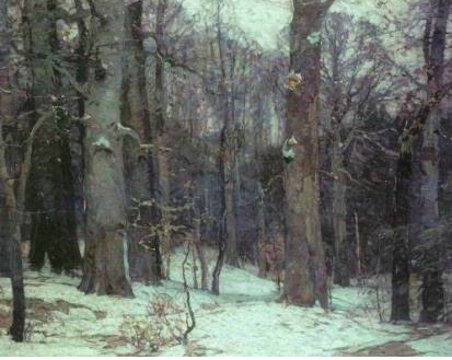
In this painting, I wanted to evoke the memory of a day in snow filled woods. The quiet muffled quality of sound, the intimacy of the deep woods, and my part in it were all on my mind. I used subtle value and temperature changes to depict the foreground snow and describe how it began to pile up on top of grasses, plants and tree trunks. Warm notes in the foreground provided a counterpoint to the violets, greys and browns.

Deborah Paris
Finally, here is a painting by Marc Dalessio (American, contemporary) which he posted on his blog. He helpfully included a photo of the scene he was painting. This provides a great example of how he has manipulated value and temperature to create an effective design. Note how the snow value has been lowered and its temperature cast shifted to a very light blue green. Notice also the warm note of pink on the edge of the shadow underneath the main tree on the right and a similar note on the other side of the road. He has also darkened the value of the trees in the distance just slightly and the main tree as well, providing needed darker notes (along with the tire tracks).


Orchestration of value and color temperature is the key to success in snow paintings. So, go out and paint some snow!
P.S. Our two day online workshop Painting Snow is a great place to learn how to make the most of the winter landscape. Join us January 18-19, 2020
!
Let it Snow!

I found this blog post extremely helpful–my own snow scenes have always left me dissatisfied, but I didn’t understand what was not working. It’s much clearer now. Many thanks!
This was very helpful and inspiring! I learned so much from the Mulhaupt about composition. Thank you for introducing him to me. Lauren
Thanks for these notes. It’s summer in New Zealand at the moment, and it’s unlikely I’ll paint snow very often, but I can still see principles I can apply. Fantastic paintings too.
tha nk you for your excellent insight to painting snow. I will really think about your suggestions which are very helpful. Your examples were all so different and yet they shared the same value and color temperature variations. I am familiar with Kearns, Delessio, Carlson and of course your wonderful work but not Malhaupt. Will have to investigate. All great painters of snow. One other that I admire is Edward Redfield. I saw a show called “The Painterly Voice” at the Michener Museum and Redfield’s snow paintings were incredibly sensuous due to the thick and juicy paint strokes. I made the comment that I had the sensation to want to lick the snow as it was so beautiful like whipped cream.