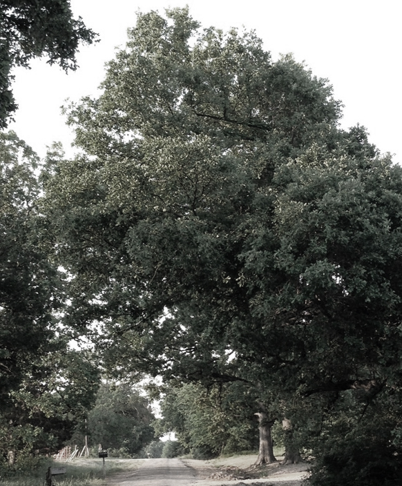
Last summer, while out for my usual early morning walk, I noticed this big foliage mass of a tree which hangs over our road. The thing that struck me about it was that it perfectly demonstrated a couple of points that come up when painting trees, and really anything in Nature. I took a picture of it hoping that the values and colors wouldn’t get too distorted and that I might be able to use it as an example. Luckily in this case, the photo shows the points I want to make pretty well. Click to enlarge.
First, as we talked about in this post, often the mid tones will be the most chromatic, that is have the most intense color. This is because the color is not as washed out by light as the lights are, and isn’t dulled as much as the shadow areas are. I think if you click on this photo you can see pretty clearly how the mid tones have a more intense green color than either the lights or the shadows.
Secondly, you can also see that the top planes of the foliage in the back right side are cooled by the light from the sky.
Third, the light struck parts of the tree facing to the left are not all the same. Those closest to the light- that is, the area on the top left are the lightest and warmest, while those more in the middle of the tree and farther away (on the right) while still struck by the light are not as light or warm. This is something that is often noted in figure drawing, but seldom discussed in landscape painting. In fairness, it is a lot more obvious on the figure because the light source is closer to the model and both are closer to the viewer, but the idea is the same.
Fourth, I think you can see that the interior shadows are warmer than the shadowed areas on the outside of the foliage mass, which we discussed in this post.
And finally, this greyscale version of the photo demonstrates how the values of the upright planes on a bright sunny day might well be darker than you think. The lights come in at about value 5. That warm green color fools our eye into thinking those lights are much lighter. But, if we paint them too light, of course, they are “out of value” and stick out like a sore thumb!
P.S. Our annual online class Drawing & Painting Trees starts September 6, 2019. Join us!


This is really helpful! I love how you’ve broken it down and made such a clear explanation!