Skies are just like other elements of the landscape- as artists we need to impose our own idea of design on the raw materials Nature provides. In this post we’ll focus on how weight, balance, asymmetry, movement, and edges can help us design our skies (and anything else for that matter).
This painting is by Wilson Hurley ( 1924-2008 ), an iconic painter of big western skies. I picked this image because it not only has a big cloud right in the middle but, it is also almost square, which tends to force the eye to the middle. So Hurley set himself a pretty interesting task when he chose this cloud to paint in this format. Summer Thunderstorm 1980 40″ x 44″
Hurley has used the idea of counterchange-that is, playing darker and lighter values against each other- to effectively design this piece. The light ground plane contrasts with the darker sky, which is then used as a foil for the lighter cloud. But, let’s look a bit deeper to see how he makes that big cloud in the center thing work so well.
In the next image we can see that although the cloud is pretty much in the center of the canvas, he has weighted the image to the left by using that bank of clouds as an anchor (which also helps to give dimension to the cloud by pushing the lit up portion forward). The bank on the bottom right has much softer edges and recedes more into the sky so its not as prominent, which of course makes the areas to the left more so. Also, the lit up portion, which comes forward and has more visual weight, is also on the left. The lightest light and the crispest edges are all in this area as well. While we are on the topic of edges, look at the variety of them in this piece!
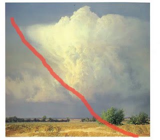
Here we can see that even though we have a very centered composition with stable horizontal lines throughout, a diagonal has been established which helps create movement. The design of the ground plane is part of this movement and helps to hold the earth and sky together visually.
All of these are compositional devices which can be used in designing skies of all types, and landscapes in general.
Thank you for these insights Deborah about this painting which I love. I copied it and in the process learned a tremendous amount about painting within a very narrow rang of values. I had not noticed the diagonal line you point out. One thing I love about this painting is the shifts in intensity of the whites.
We use cookies to ensure that we give you the best experience on our website. If you continue to use this site we will assume that you are happy with it.


Thank you for these insights Deborah about this painting which I love. I copied it and in the process learned a tremendous amount about painting within a very narrow rang of values. I had not noticed the diagonal line you point out. One thing I love about this painting is the shifts in intensity of the whites.
Great analysis of this effective landscape composition.